Thumbnails
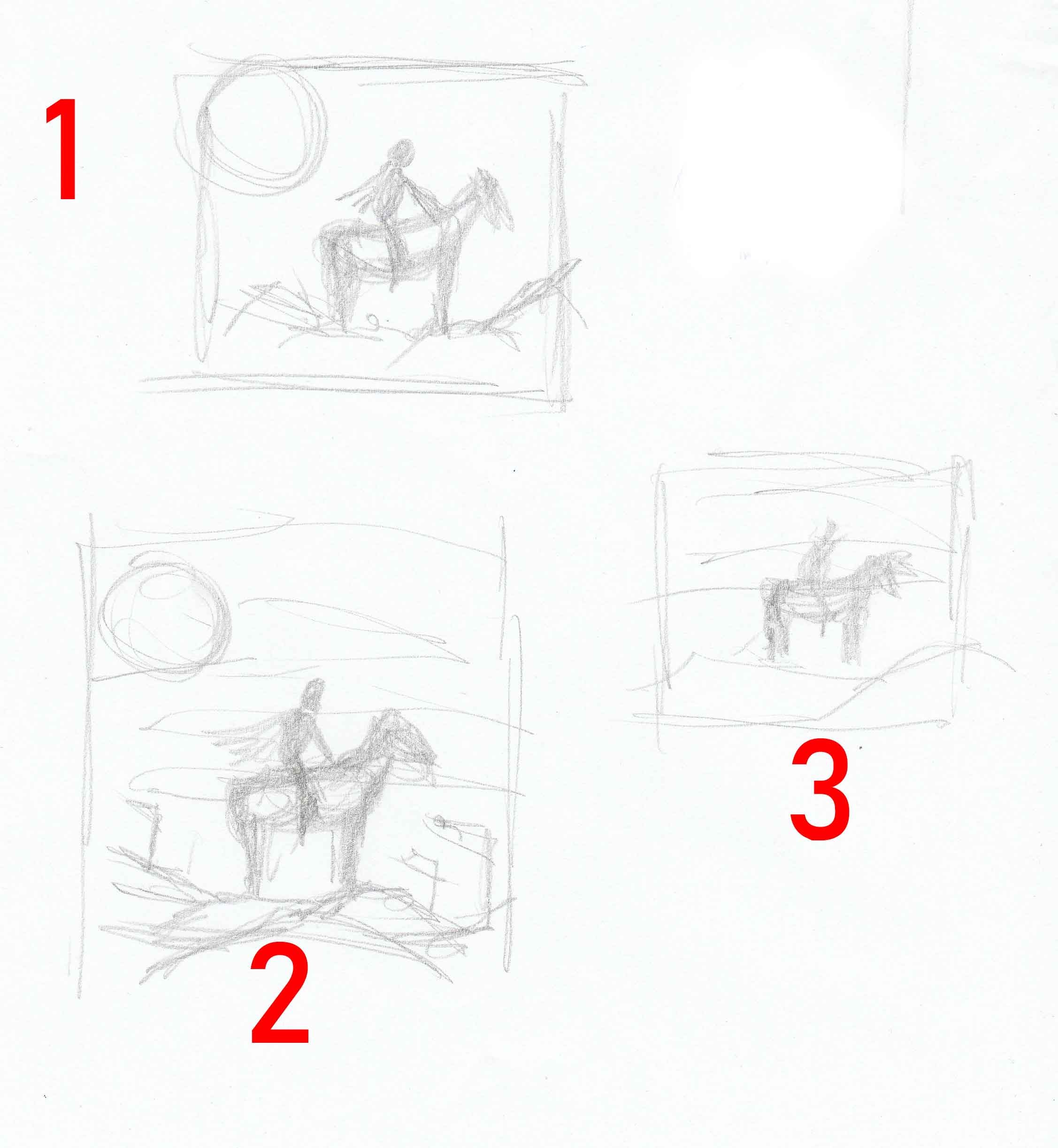
Alright, here we are again. Thank you for reading this new post. I am going to my series on my working method. This installment will cover thumbnails. Let me start by explaining what thumbnails are for those that may not be certain. Basically, thumbnails are small very simple sketches used to show your idea. When I say very simple, I mean no real detail at all. Their purpose is generally to show and work out ideas. Keeping these sketches small and unrefined allows you to focus composition without being concerned with drawing details. Below are three thumbnails I did for a project I’m currently working on. Each is slightly different. I already had an idea of what I wanted to do; the thumbnails just aid me with visuals. Now of course these are practically chicken scratch, but the purpose is getting what is in my head organized on paper.
1) This was the first thumbnail I came up with, just a horse and rider with the moon above. A very simple sketch, no detail.
2) Very similar to the first with flags and a slight indication of clouds.
3) Same as the first two minus the moon and flags, even more simple. Remember, aesthetics is not the goal.
I settled on number 2, of course there is the chance that the finished product will only resemble the thumbnail. The end illustration doesn’t have to be a carbon copy of the thumbnail, it should evolve. Well, that’s it for now. I know this one was short but it’s still important. Next time I’ll cover the next step, reference. So until month…
Always
Be
Creating

